Assignment 1: Space
|

|
| ||||
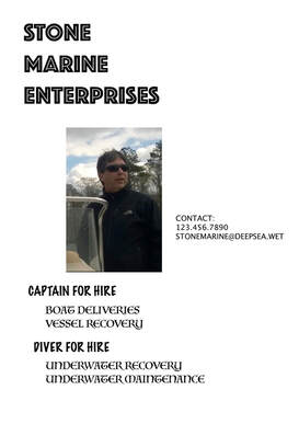
The original image conveyed important information. However, the information was hard to view, and even harder to process. The large image in the center drew most of the viewers’ attention. Upon a glance the only information I gained from the original graphic was that the man in the picture is on a boat.. The other text in the graphic was very small, and the font was nearly impossible to read. This made the viewer strain to read the text, not understand it. Overall the information needed was not the primary focus of the original graphic.
In the remake of this image I ensured there was white space to separate the key elements of the graphic. The white space helps to chunk the information. By chunking the information, the viewer can process small portions of information at a time. This helps to reduce cognitive load. I also chose to place the company name, Stone Marine Enterprises, in the top left of the screen, as this area is typically proven to draw viewers’ attention. This design looked great when a wider layout (landscape) was utilized. Although the assignment requited 1200X1800, I would prefer to use 1800X1200. Lastly, I chose a font that was large and thick. This helps the viewer easily read the information provided. I attempted to control visually hierarchy and sequence. I included varying font sizes, with the largest fonts being of primary importance.
In the remake of this image I ensured there was white space to separate the key elements of the graphic. The white space helps to chunk the information. By chunking the information, the viewer can process small portions of information at a time. This helps to reduce cognitive load. I also chose to place the company name, Stone Marine Enterprises, in the top left of the screen, as this area is typically proven to draw viewers’ attention. This design looked great when a wider layout (landscape) was utilized. Although the assignment requited 1200X1800, I would prefer to use 1800X1200. Lastly, I chose a font that was large and thick. This helps the viewer easily read the information provided. I attempted to control visually hierarchy and sequence. I included varying font sizes, with the largest fonts being of primary importance.

Assignment 2: Graphic Choice

|
|
| ||||
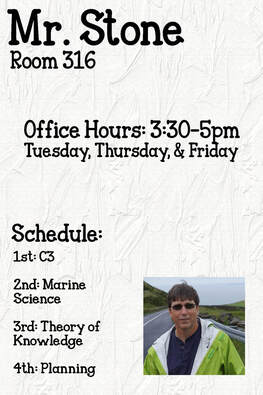
The original image conveyed important information. However, the information was hard to view, and even harder to process. The large image in the center drew most of the viewers’ attention. Upon a glance the only information I gained from the original graphic was that the man in the picture's name is Mr. Stone. The other text in the graphic was very small. This made the viewer strain to read the text, not understand it. Overall the information needed was not the primary focus of the original graphic.
In the remake of this image I ensured there was white space to separate the key elements of the graphic. The white space helps to chunk the information. By chunking the information, the viewer can process small portions of information at a time. This helps to reduce cognitive load. I also chose to place the instructor's name in the top left of the screen, as this area is typically proven to draw viewers’ attention. In addition, a consistent boarder was used throughout the graphic. I determined that realistic graphics would meet the needs of the viewers. I also chose the realistic image in order to show a concrete subject. In addition, I also cropped the image to better suit the overall appearance of the product. To better meet the needs of this graphic, I made the image of Mr. Stone smaller. Although his image is relevant, it is not the main focus of the presented information. Lastly, I chose a font that was large and thick. I used this font consistently throughout the graphic. This helps the viewer easily read the information provided.
In the remake of this image I ensured there was white space to separate the key elements of the graphic. The white space helps to chunk the information. By chunking the information, the viewer can process small portions of information at a time. This helps to reduce cognitive load. I also chose to place the instructor's name in the top left of the screen, as this area is typically proven to draw viewers’ attention. In addition, a consistent boarder was used throughout the graphic. I determined that realistic graphics would meet the needs of the viewers. I also chose the realistic image in order to show a concrete subject. In addition, I also cropped the image to better suit the overall appearance of the product. To better meet the needs of this graphic, I made the image of Mr. Stone smaller. Although his image is relevant, it is not the main focus of the presented information. Lastly, I chose a font that was large and thick. I used this font consistently throughout the graphic. This helps the viewer easily read the information provided.
Assignment 3: Type
Before
Photoshop File
|
After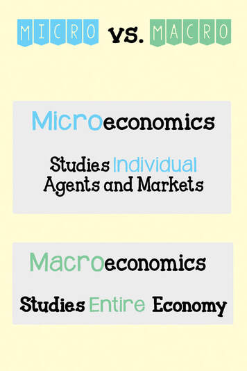
| |||||
In this assignment I focused on the information presented in Chapter 6, of Visual Design Solutions (Wiley, 2015). This chapter focuses on working with Type.
The original design used the same font type throughout the instructional graphic. The differentiation between term and definition was represented through different font sizing. This caused the definition to become small and difficult to read. In addition the background was solely grey. This did not elicit the attention of the learner. The lack of contrast between terms made the information appear the same, and therefore more difficult for the learner to process the information into their long-term memory.
In the remake of this informative graphic I mixed typefaces. I did this to make key components of the graphic stand apart from the rest of the text. For the key differences I used a font that depicted Serif Typefaces. The additional information is comprised in a script typeface. The contrast is subtle, but enough to draw the learners attention where intended. I also implemented contrasting weight. The key information is represented in a bold font, as well as colored font. The text is center aligned without Kerning. I purposefully avoided placing text on textures, and used contrasting background and colored boxes to separate information.
Assignment 4: Color
Before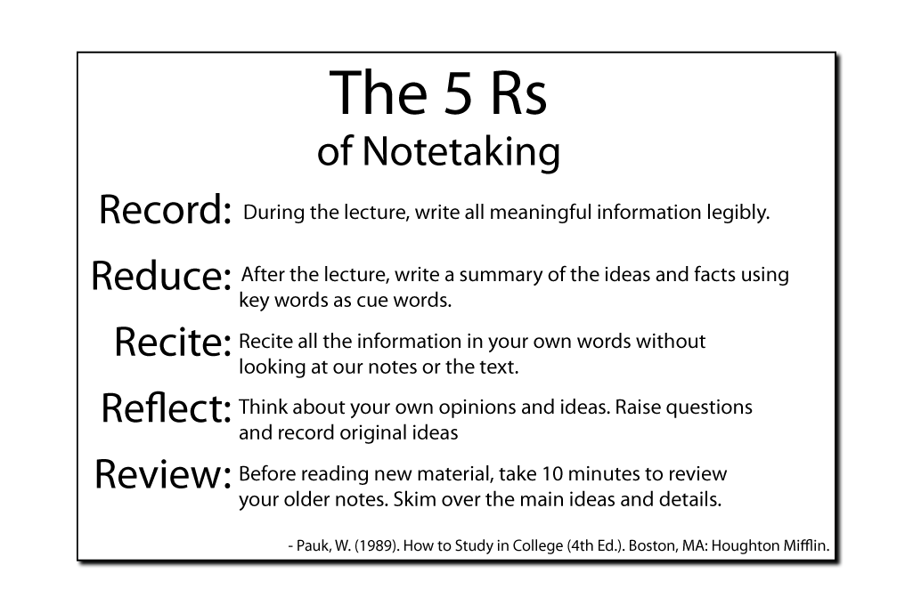
Photoshop File
|
After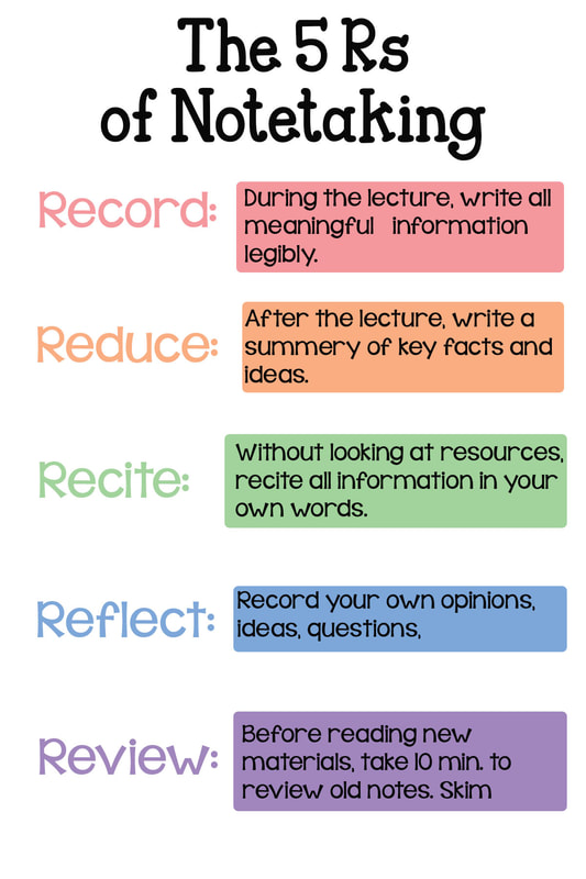
| ||||
In this assignment I focused on the information presented in Chapter 8, of Visual Design Solutions (Wiley, 2015). This chapter focuses on working with color.
The original instructional graphic lacked color. This caused the information to become difficult for the learner to separate the key points of information. This also caused cognitive overload for the learner. The definitions themselves were also too wordy for amount of space provided. The spacing and margins were also inconsistent. This inconsistency distraction for the learner.
For this instructional graphic remake I decided to use pastel colors. I chose these pastel colors because they are an even mixture of calming and exciting colors. They are not harsh, and visually appeal to the learner. I also put the colors in a specific order, resembling the rainbow. This color pattern is familiar to viewers, and therefore less distracting. I also chose this color pattern because it tells a story/ has meaning. When one color/ R is used, the effectiveness of the 5Rs is incomplete. The more colors/ Rs utilized, the more effective the strategy will be. The colors selected utilize medium-low saturation. The term and definition background were color coded and placed in close proximity to decrease cognitive overload and the split attention effect. In addition, the use of whitespace and consistent margins in this design allow for a non-distracting separation of information.
Assignment 5: Visual Hierarchy
Before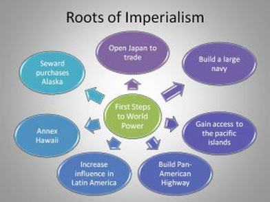
In this assignment I focused on the information presented in Chapter 8, of Visual Design Solutions (Wiley, 2015). This chapter focuses on establishing a visual hierarchy.
The original instructional graphic lacked an appropriate visual hierarchy. In the original informative graphic my eye was drawn to the green circle in the center circle. This is due to the bright color and the natural highlighting caused by the background. Additionally, the different sized arrows made me want to view the information next to the largest arrows. In my remake of this instructional graphic I used various strategies to create visual hierarchy. First I placed the title at the top of the graphic. To draw the viewers’ attention to this area first, I used a large font and bright background. Next I want the viewers’ attention to be drawn to the subtitle. Therefore, I placed this information directly below the title in a slightly smaller font and a slightly paler background color. Lastly, I wanted my viewer to read the facts listed. I used a slightly smaller font size and duller color to represent these facts as the next portion viewers are to read. These facts are of equal importance to each other. Therefore, I used the same size backgrounds and placed them in a circular format. I did struggle with finding a representation I liked for the facts as there were seven facts. This odd number made it difficult to find a visually appealing structure. |
After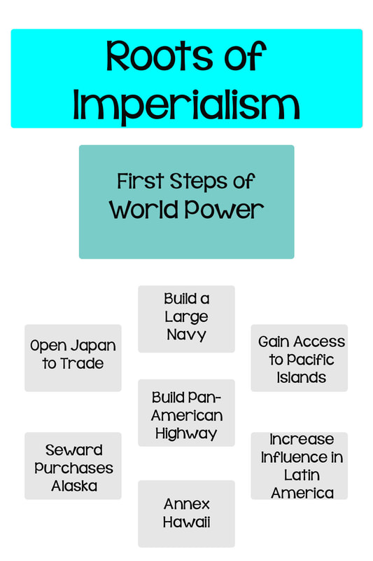
| ||||||
Assignment 6: Visual Cues
Before |
After |
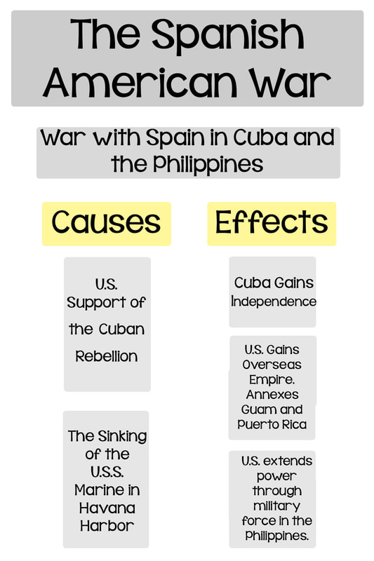
In this assignment I focused on the information presented in Chapter 12, of Visual Design Solutions (Wiley, 2015). This chapter focuses on highlighting essential information using visual cues.
The original instructional graphic lacked many essential components in creating a beneficial instructional graphic. One specific is the lack of visual cues. The text was all the same size and font. The background boxes were all the same color, and the location of information was poorly planned. In my remake of the instructional graphic I started by using neutral colors for most information. This allowed the yellow color of the essential sub-titles to be prominent. Upon viewing the instructional graphic the viewer reads the title, as most readers are trained to do first. Then the viewer quickly understands that this visual aid will inform them of the causes and effects of the Spanish American War. The subtitles are placed evenly. This helps the viewer to comprehend their equality and not assume ones importance over the other. Subliminal cues are also given to the view through the use of color. As the information is presented through the graphic, the shade of grey becomes lighter. This cues the view to begin at the more prominent grey and progress to the lighter shades. |
| ||||||
After #7: Visual Unity
Before |
After |
In this assignment I focused on the information presented in Chapter 9, of Visual Design Solutions (Wiley, 2015). This chapter focuses on creating visual unity.
The original instructional graphic lacked many essential components in creating a beneficial instructional graphic. Specifically, the lack of visual unity and uniqueness. In addition the original graphic was not visually appealing, did not have suitable text, and had an unappealing font. The original instructional graphic lacked a title, therefore leaving the viewer unaware of the overall content being portrayed. In the remake of this instructional graphic includes many instructional design principles that the former design lacked. To begin a more visually appealing font was selected. This created a sense of visual unity, as a consistent font was utilized throughout. To provide distinct segmenting, varying font sizes were used. In addition, implied lined were used to signify visual unity. Similarly, the position and alignment of text was placed strategically to represent visual unity. In addition shades of blue were used as background colors to provide visual unity. Although blue is used as background colors throughout the graphic, the varying shades of blue symbolize variety within the graphic. Lastly, the background coloring was also used to highlight the two differing terms and definitions provided within the instructional graphic. |
| ||||||
Before and After # 8

In this assignment I focused on the information presented in Chapter 10, of Visual Design Solutions (Wiley, 2015). This chapter focuses on creating contrast.
The original instructional graphic lacked many essential components in creating a beneficial instructional graphic. Specifically, the lack of contrast. In addition the original graphic was not visually appealing, did not have suitable text, as the text was burry, too small in portions, and even too small to read at times. The original instructional graphic had all the information clustered together, therefore leaving the viewer unaware of the location of essential information. The remake of this instructional graphic includes many instructional design principles that the former design lacked. To begin a more visually appealing font was selected. The new font is bolder, allowing the viewer to read without straining their eyes. The font selection created a sense of visual unity, as a consistent font was utilized throughout the graphic. To provide distinct segmenting, varying font sizes were used. This also allowed for the viewer to determine essential information and provide a path for viewing (starting with the larger font and moving to the smaller fonts). In addition. In addition green was used as the background color to provide highlight essential information and provide contrast from the rest of the graphic. |

| ||
Before and After # 9
In this assignment I focused on the information presented in Chapter 11, of Visual Design Solutions (Wiley, 2015). This chapter focuses on grouping for meaning.
The original instructional graphic lacked many essential components in creating a beneficial instructional graphic. Specifically, the lack of grouping. The information presented in the original graphic was placed on a consistent background that distracted the viewer from the information. In addition the original graphic was not visually appealing. The original instructional graphic had all the information clustered together, therefore providing no sense of grouping. The remake of this instructional graphic includes many instructional design principles that the former design lacked. To begin, the distracting background was eliminated. Grouping was then applied to the graphic. The graphic can be segmented into three parts. The title, which is large and portrayed on a colorful background, drawing the viewers’ attention. Next, is the image. The original graphic lacked an image. By adding a pictorial representation the viewer is more likely to move the information from working memory to long term memory. The final grouping is the definition, which provides an explanation of the pictorial representation. A more visually appealing font was selected. The new font is bolder, allowing the viewer to read without straining their eyes. The font selection created a sense of visual unity, as a consistent font was utilized throughout the graphic. To provide distinct segmenting, varying font sizes were used. This also allowed for the viewer to determine essential information and provide a path for viewing (starting with the larger font and moving to the smaller fonts). Margins were utilized to provide proximity between various groupings. Specific shades of blue were chosen to provide similarity among the graphic, while also providing unique contrast among the numbers in the visual representation. |
| ||
Before and After #10
Before |
After |
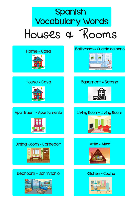
In this assignment I focused on the information presented in Chapter 13, of Visual Design Solutions (Wiley, 2015). This chapter focuses on creating an exciting design.
To be frank, I think the original instructional graphic I selected for this assignment is the most boring learning aid I have ever seen! It reminds me of the nutrition facts on the back of food packaging, and let's be honest, no one likes to read those. The original graphic lacked color, an appealing font, differentiation, and visual representations. The original instructional graphic lacked margins and contrast. Although the font was easy to read, the lack of margins and placement of text caused the words to blend together. In the remake of the instructional graphic I utilized methods that would make the instructional graphic more exciting. I started by selecting more visually appealing fonts. I decided to utilize two fonts. I did this to make the main topic (houses and rooms) stand out. I then implemented a color theme as the background boxes. This helped to separate the content, while maintaining similarity and consistent margins. I also decided to change the text only method of presenting information to text and image. The placement of essential vocabulary words also allows the information to be segmented, and therefore easier for the viewer to comprehend. |
| ||||||
Before and After # 11
Before |
After |
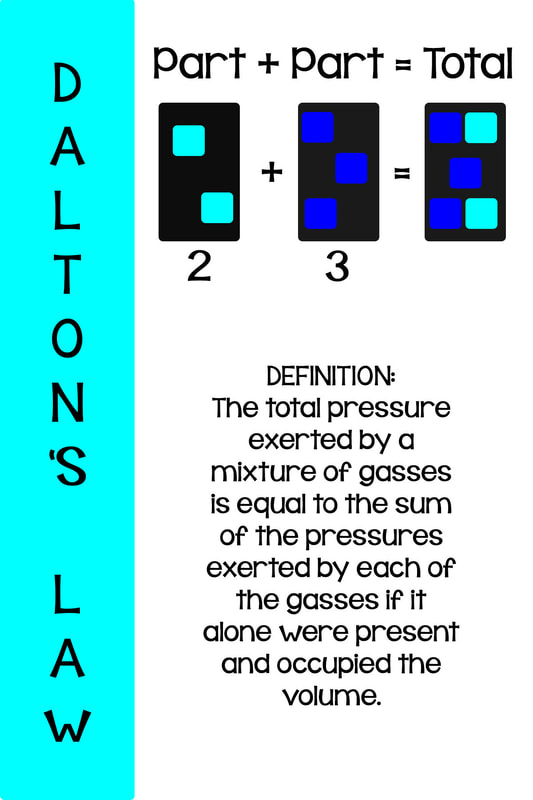
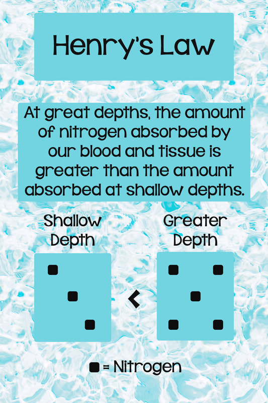
In this assignment I focused on the information presented in Chapter 14, of Visual Design Solutions (Wiley, 2015). This chapter focuses on utilizing visuals to improve comprehension.
The original instructional graphic lacked quality visuals. The visual utilized actually hindered comprehension as it was difficult to understand what the visual was trying to convey. The small title located in the upper corner was not noticeable at first. This caused the learner to spend unnecessary time trying to determine what the purpose of the graphic was. The definition's placement on the textured background made it strenuous to read. In the remake of this instructional graphic I organized the information in a top-down flow. The learner would be drawn to the large title, providing them with the purpose of the instructional graphic, as the learner progressed down the page they were able to easily read the definition as it was designed with an appealing and bold font that was placed on a flat/non--textured background. After learners read the definition they were provided with a visual that would help them further process the information. The visual is simple, yet provides the desired information. I included a key, so the learner would not have to spend time trying to determine what the dots in the graphic represent. I also chose to use the common symbol, the less than symbol to convey information within my visual. My goal is for the additional information presented in each third of the instructional graphic to present additional information that will help the learner process the information from sensory memory, to working memory, and finally into long-term memory. |
| ||||||
Before and After #12
Before |
After |
In this assignment I focused on the information presented in Chapter 16, of Visual Design Solutions (Wiley, 2015). This chapter focuses on identifing the impacts of visualization for learning and instruction.
|

| ||||||
